The San Franciscan Magazine
A logo honoring the past
The Ask…
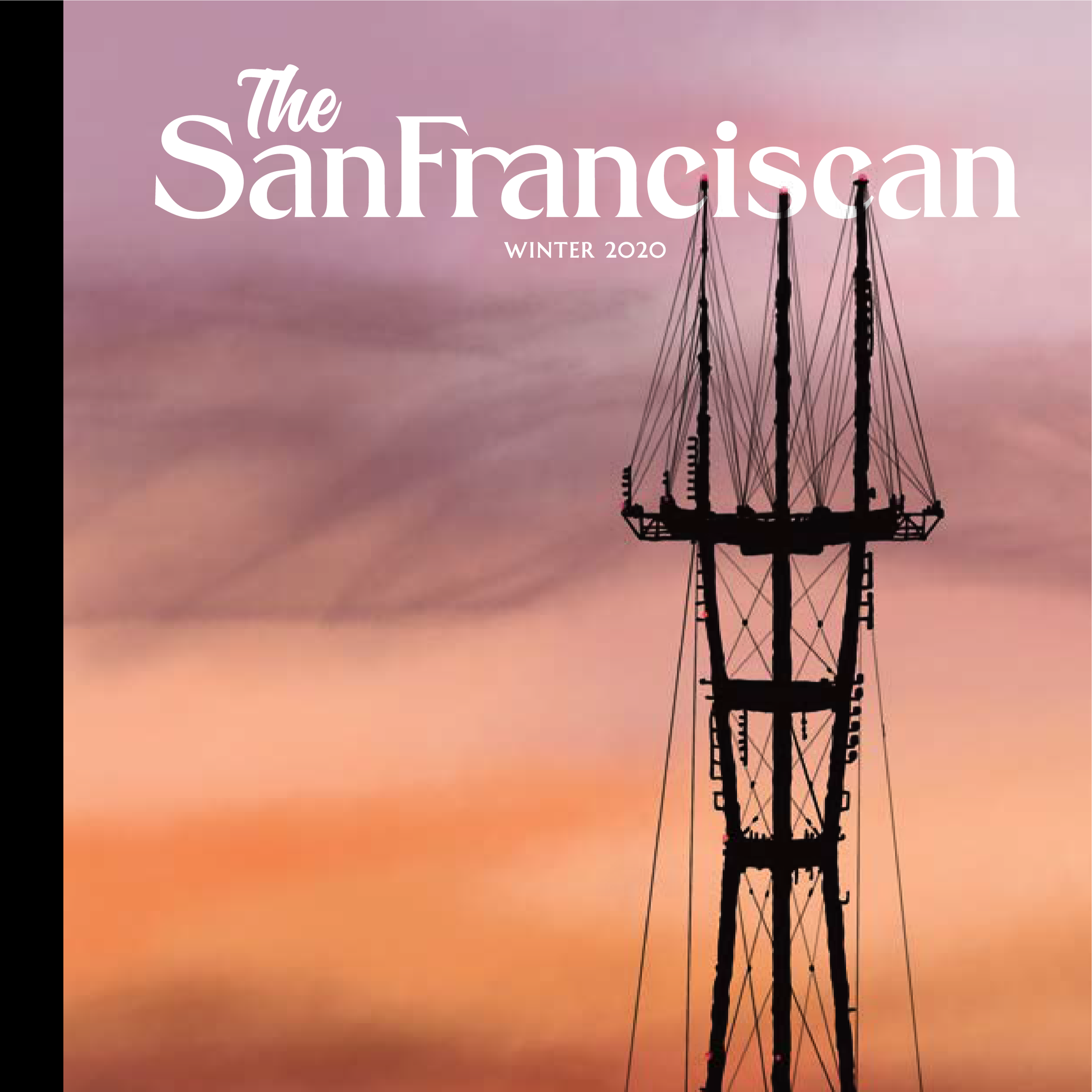
I was asked to create a masthead for a new San Francisco-based magazine, The San Franciscan. The request was that the mark honors the city's arts, culture, and community. The mark needed to be proud without being loud–an elegant statement with a clever wink.
Doing my research
San Francisco has over a hundred years of material from which to take inspiration. So many movements and important historical eras were started and flourished here. But I kept returning to the Gilded Age before the 1906 earthquake and the Great Fire that erased so much of the city’s history.
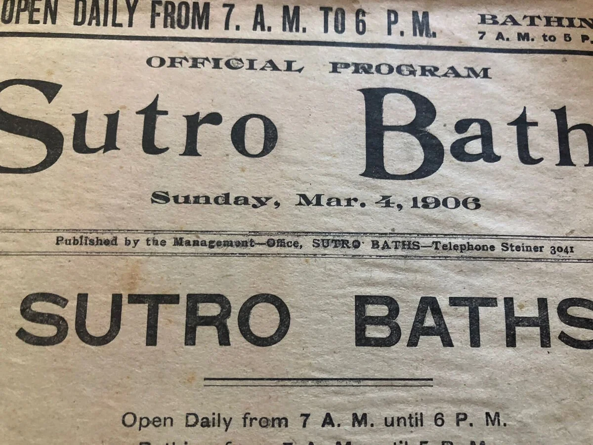
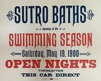
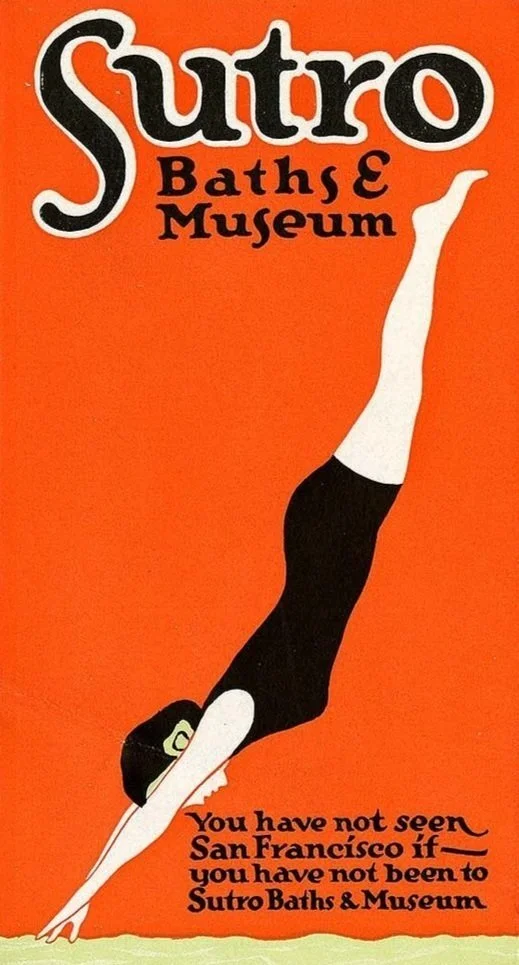
One of the iconic places of that time was the Sutro Baths. Opened in 1894, it was a symbol of the ingenuity and fun that symbolizes San Francisco and I thought it was a great source of inspiration
The Solution
The final logo is inspired by the Sutro advertisements' headlines. The letterforms were full and had a lot of flourishes, but I modernized 19th-century decadence with modern legibility.
As for the clever aspect. I again took inspiration from a classical SF reference, namely the Tony Bennet song, I Left My Heart In San Francisco. I intentionally created a ligature between the lowercase r and an in the word and used the negative space to create a heart, yes, left in San Francisco.


